

CENTRO DO CLIMA
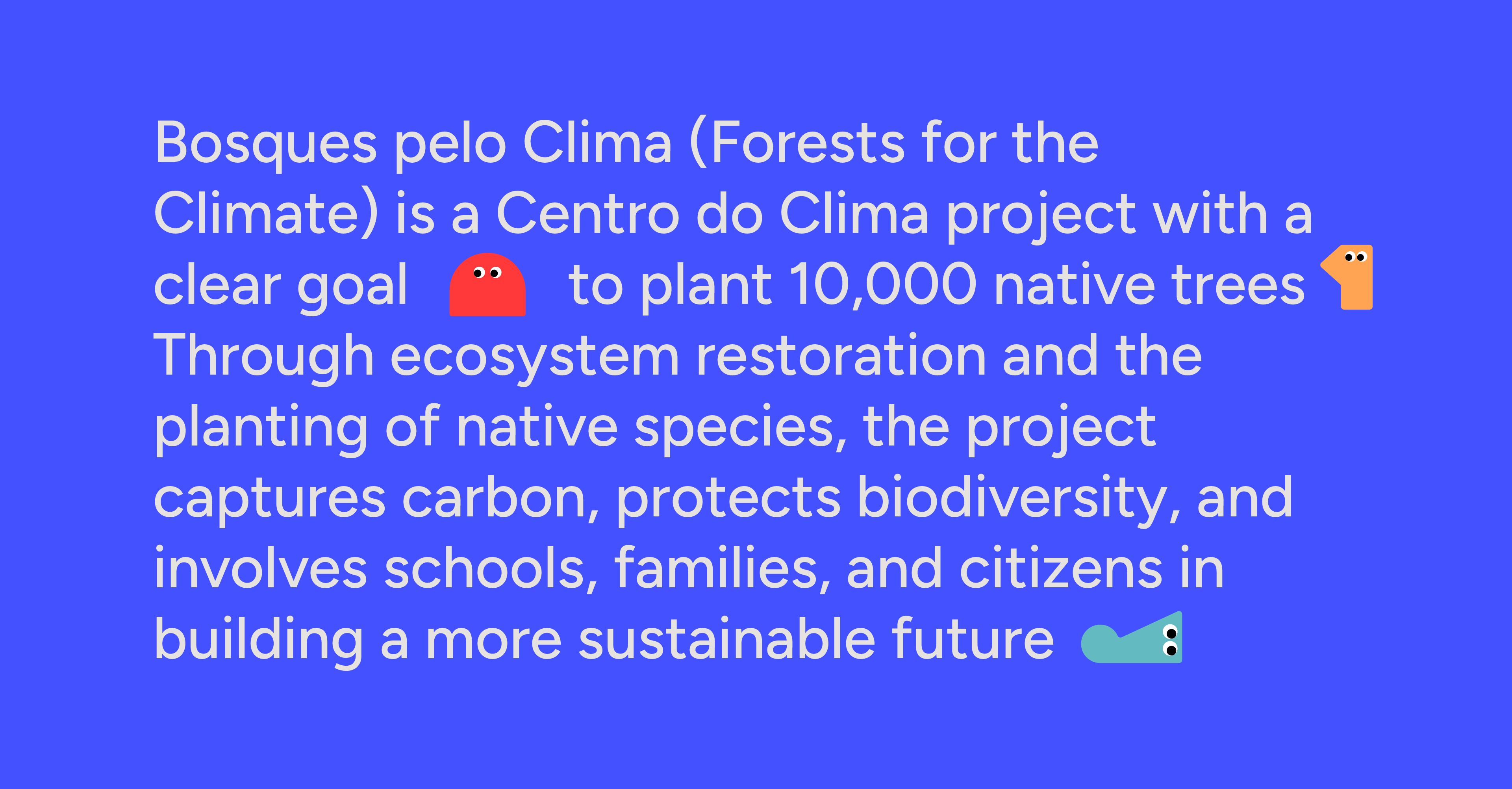
Centro do Clima is a collaborative initiative dedicated to climate action, working across four pillars: Air, Water, Fire, and Earth. This project proposes a complete visual identity redesign, aimed at making the institution's communication more accessible, modern, and engaging, bringing its projects closer to younger audiences and the wider community. The identity was developed as a strategic tool to bridge the gap between technical environmental knowledge and people, without compromising the seriousness of the climate cause.
Challenges
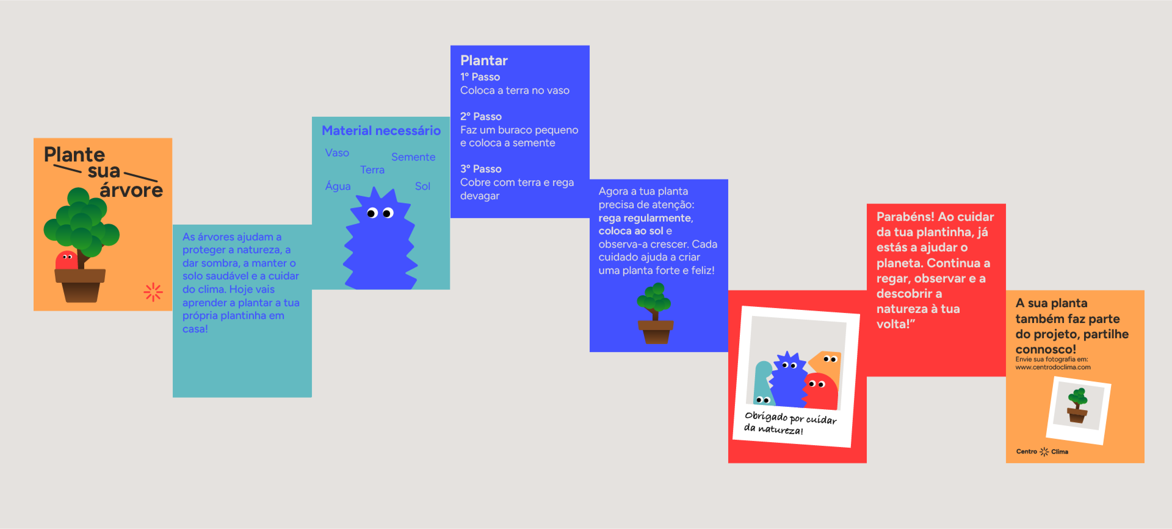
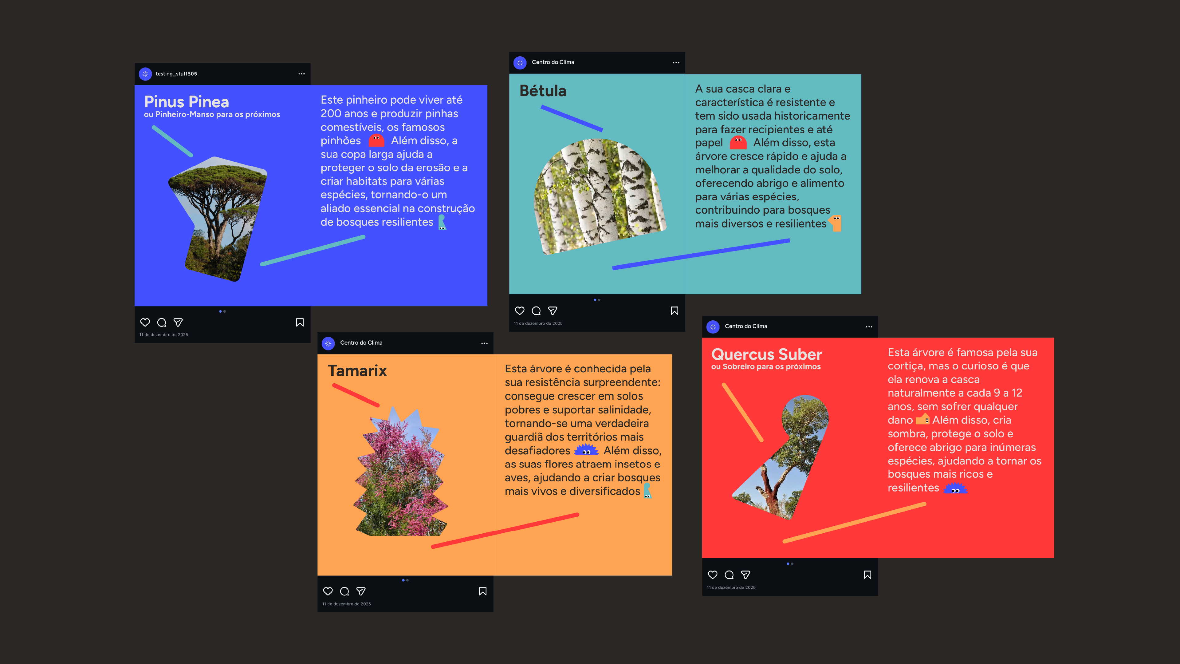
Although Centro do Clima operates in areas fundamental to sustainability, its communication faced challenges in terms of clarity, approachability, and visual recognition. The main challenge was creating an identity capable of simplifying complex and abstract topics, making them understandable and emotionally accessible, especially for children and young people. It was also necessary to ensure the new identity was versatile enough to work across very different formats, from educational materials and posters to social media and institutional signage, while maintaining visual consistency throughout.
Solution
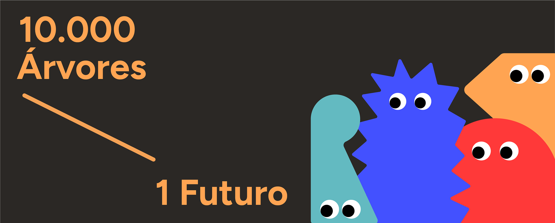
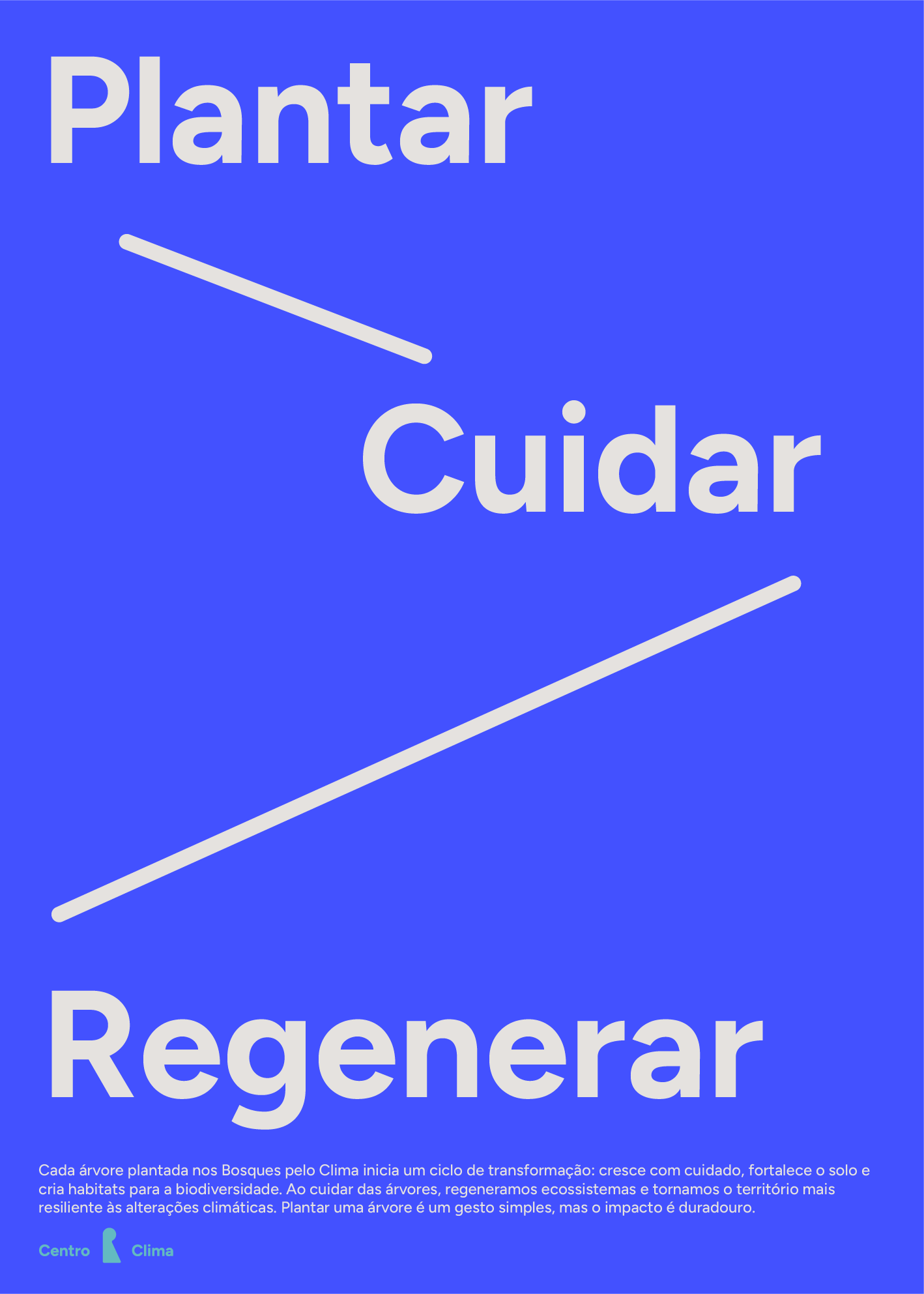
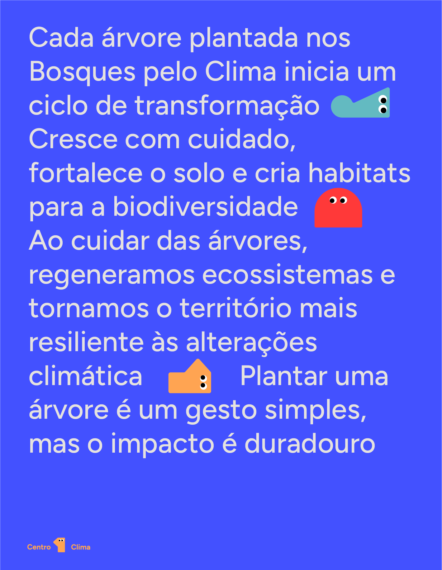
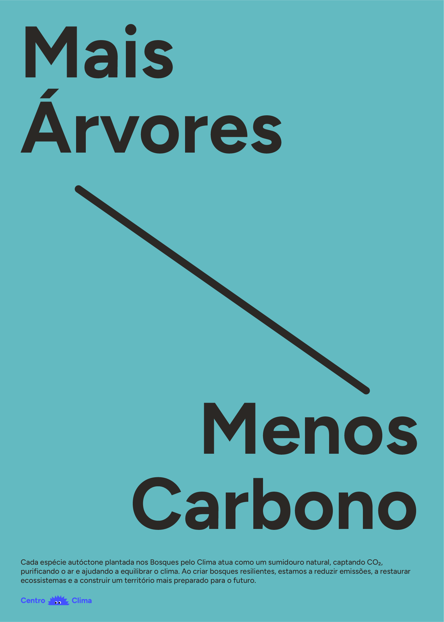
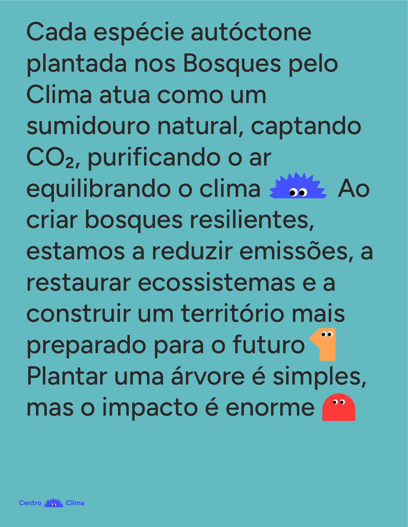
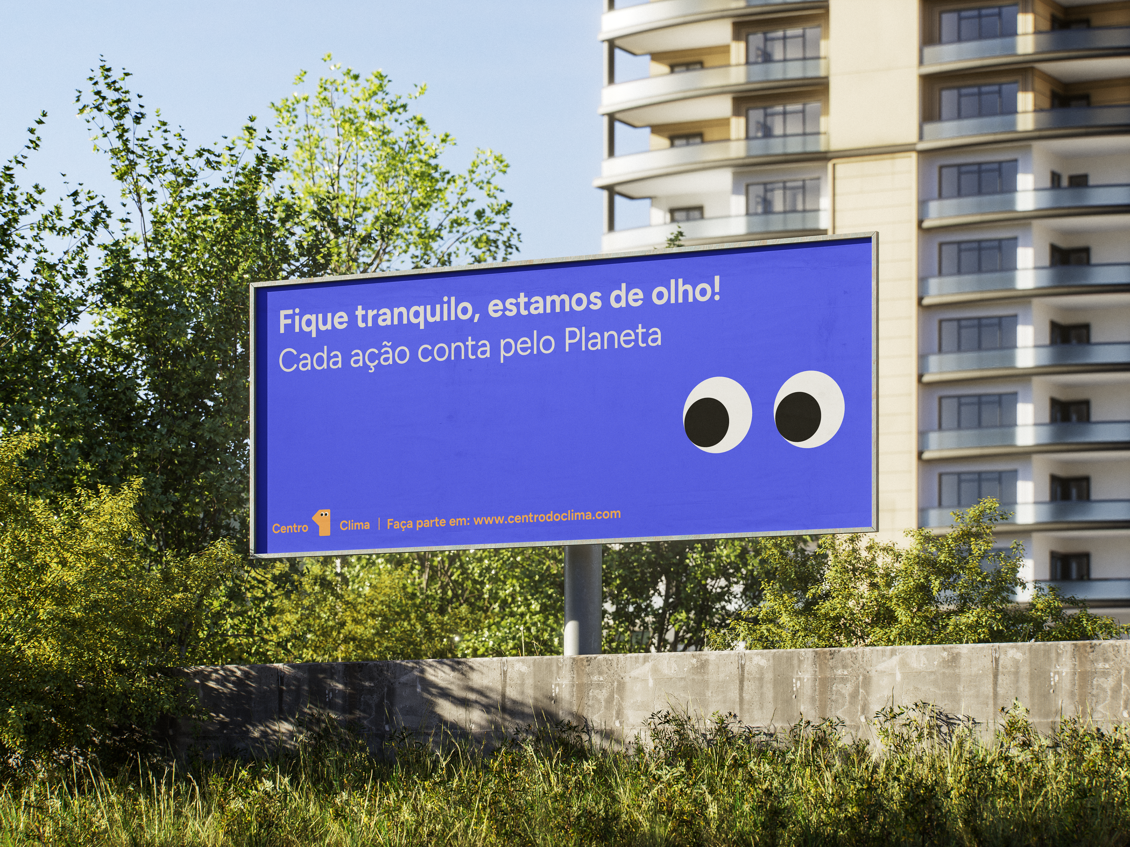
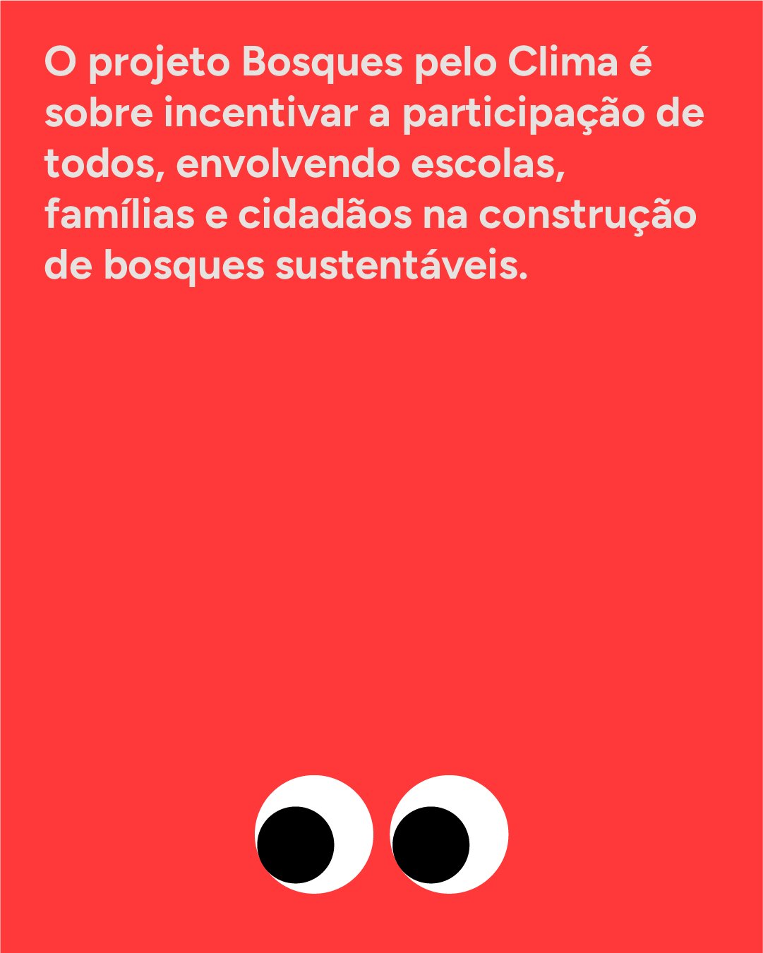
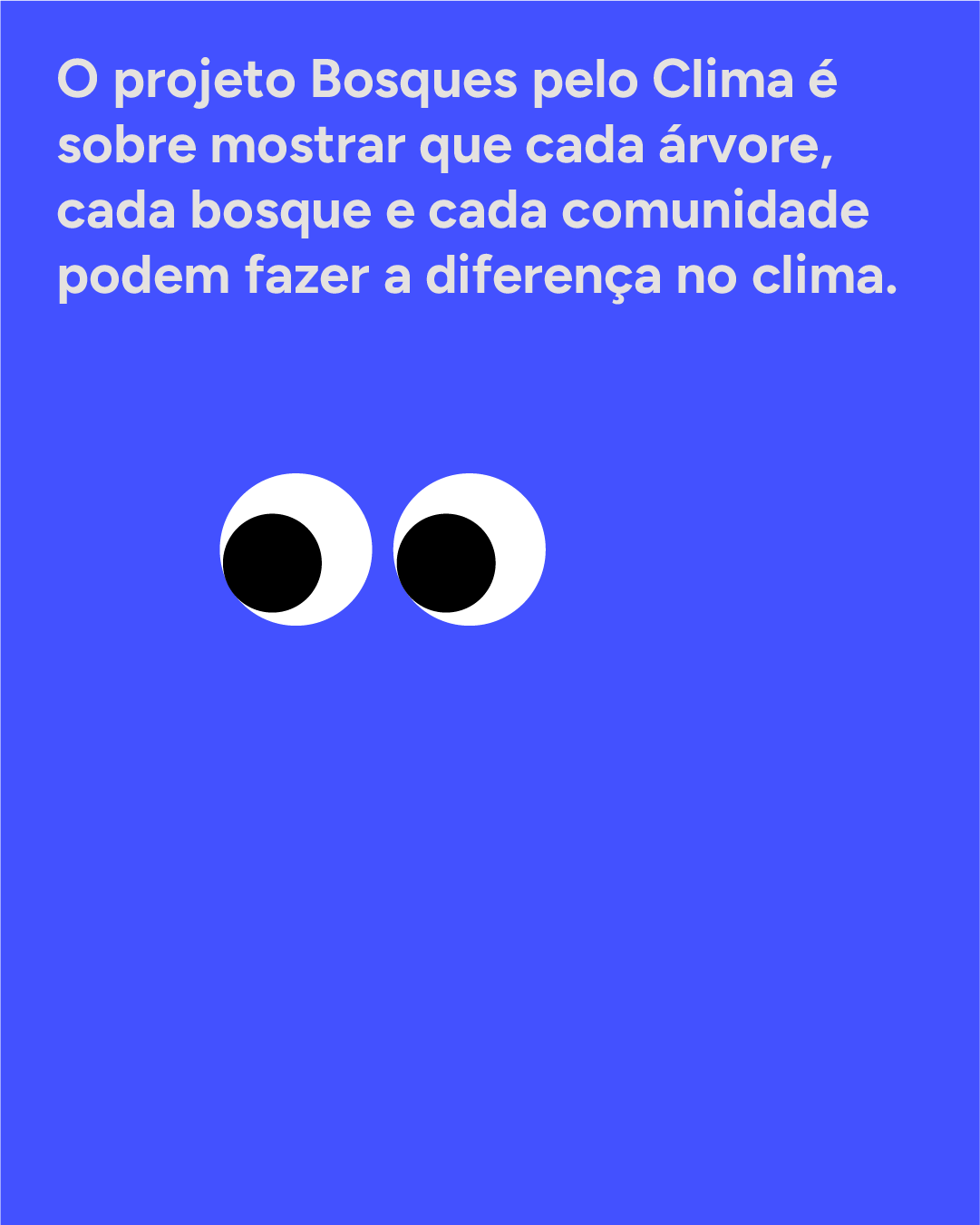
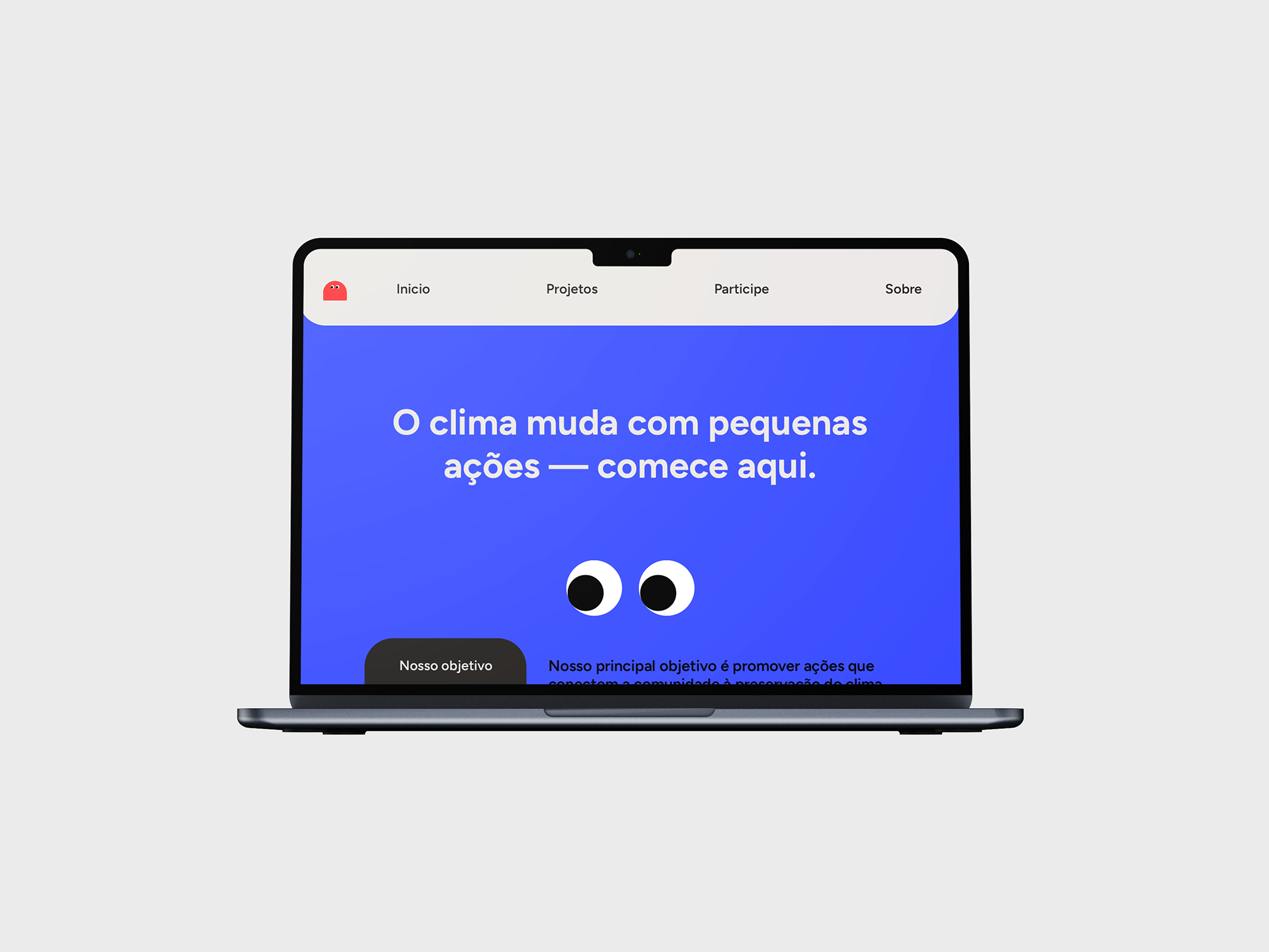
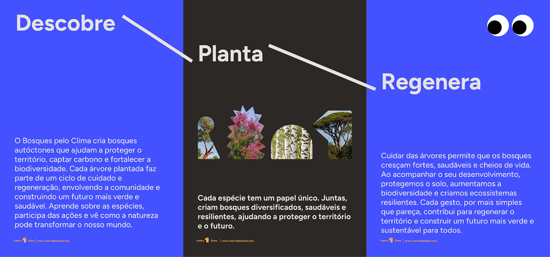
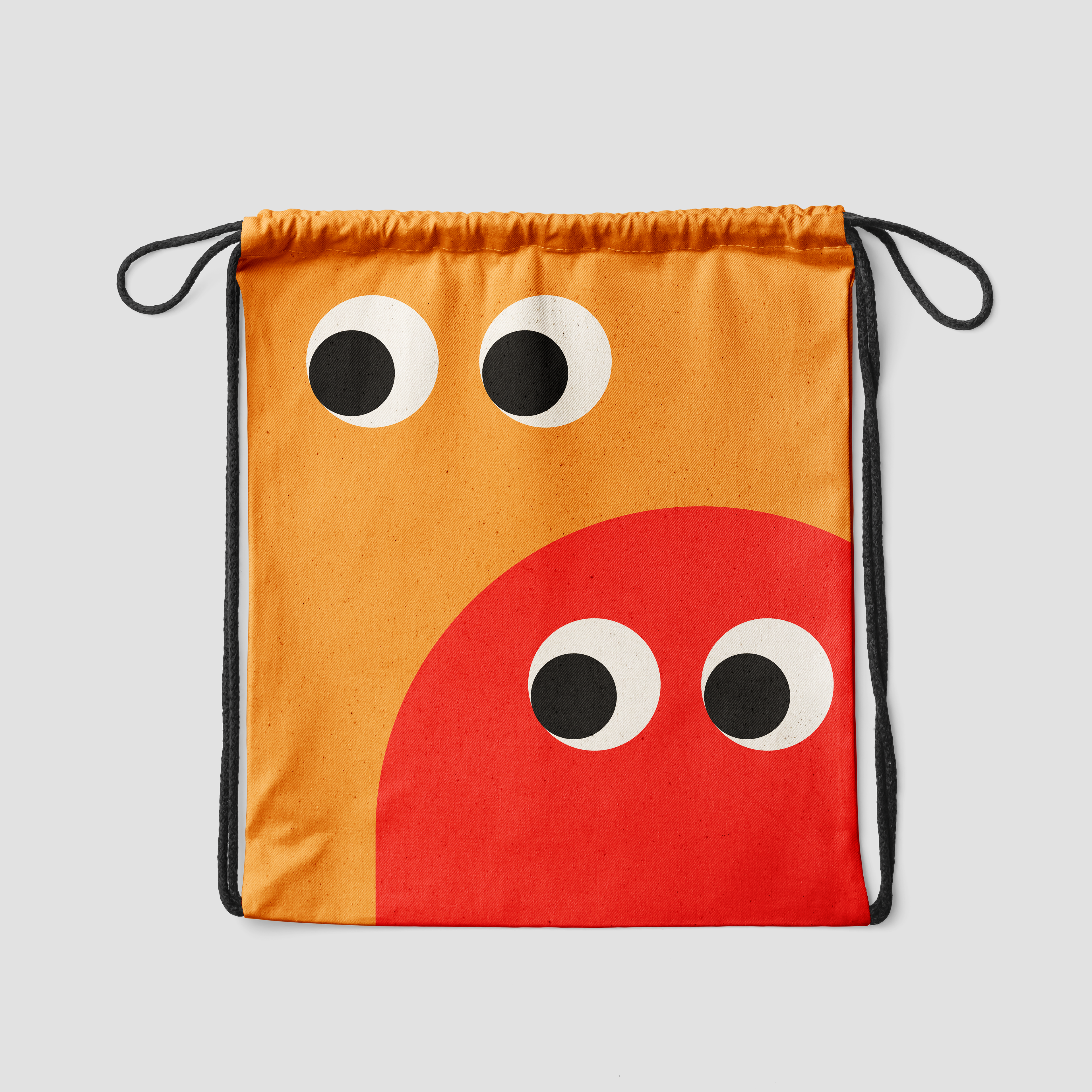
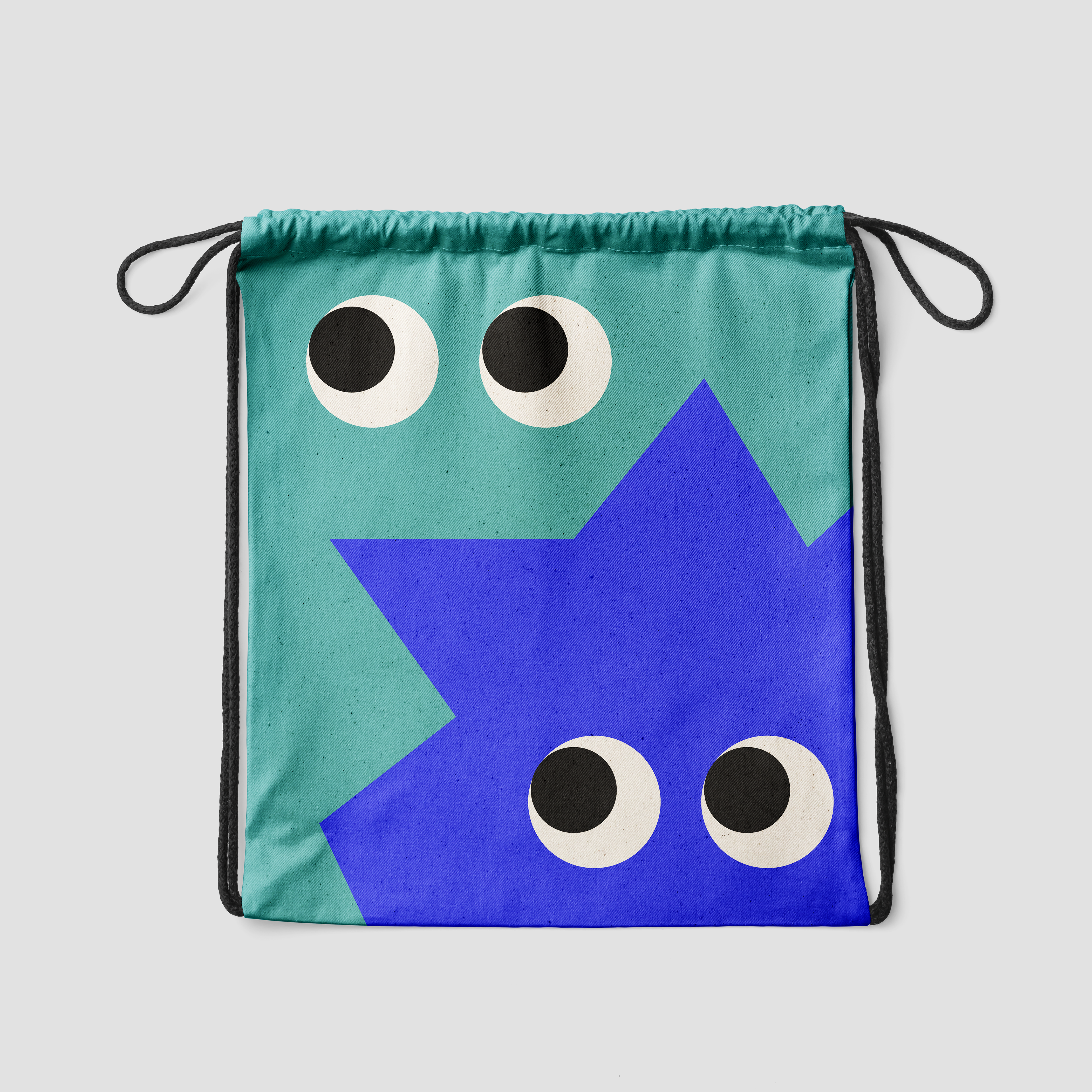
he core solution was the development of a visual system built around four mascots: Geb (Earth), Sekhmet (Fire), Shu (Air), and Tefnut (Water), inspired by Egyptian mythology gods and their corresponding hieroglyphs. Each character was synthesized into a contemporary graphic form, with rounded contours and expressive eyes that serve as a unifying element across the system. The mascots were integrated directly into the logo, replacing the word "do" in "Centro do Clima," and applied consistently across posters, social media, a school campaign, the website, and physical merchandise such as badges and drawstring bags. The Polymath typeface complemented the whole system, reinforcing the identity's modern and welcoming character.
Result
The result is a cohesive, playful, and strategic visual identity that transforms Centro do Clima into a more relatable, memorable, and effective brand. The mascots became the primary recognition point of the brand, enabling varied applications that always maintain visual consistency. The identity demonstrates how communication design can be an active instrument in environmental education and community engagement, informing, involving, and inviting participation in a conscious and lasting way.

Client: Centro do Clima
Graphic Design: Giovana Kumschlies
Motion Graphics: Letícia Pitta
www.giovanakumschlies.com